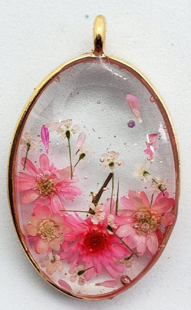


I heard about your work through a coworker, I went on the website and was so impressed looking through the work, I ordered these beautiful flower coasters that same night That look amazing in my living room. The product was shipped and delivered within a week. And I am extremely happy with them. I will order more in the future for sure. 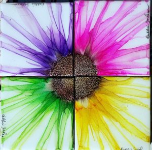

This was an amazing piece that went perfectly for what we were looking for. Debbie was great and quick to respond every step of the way to ensure all went well. Thank you again debbie! 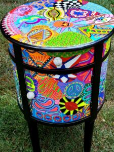

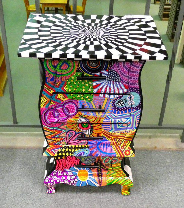
The table we purchased from Debbie did it! Is a real art-piece! Beautifully painted and great fun to own. The table arrived exactly as pictured, and it was packed with greater care than I have ever experienced with anything I have ever had shipped to me before. We could not be happier having made this great purchase from Debbie did it! 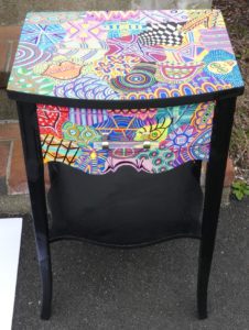

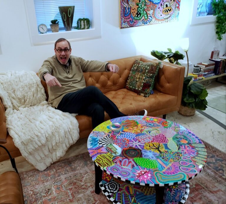
Debbie created a two-tier coffee table for my therapist office and it is absolutely fantastic. It is beautifully done and way more than I expected. It has become so popular that I have clients taking pictures of it (I’m not kidding). Debbie was great to work with, and if you are searching for a beautiful, completely unique piece, she is who you are looking for. Thank you Debbie!